Price change impact
The Price Change Impact tab closes the loop on pricing decisions: it shows how the price changes you actually made played out in revenue and profit. Where Assess Impact predicts a scenario before publish, this tab measures reality afterwards.
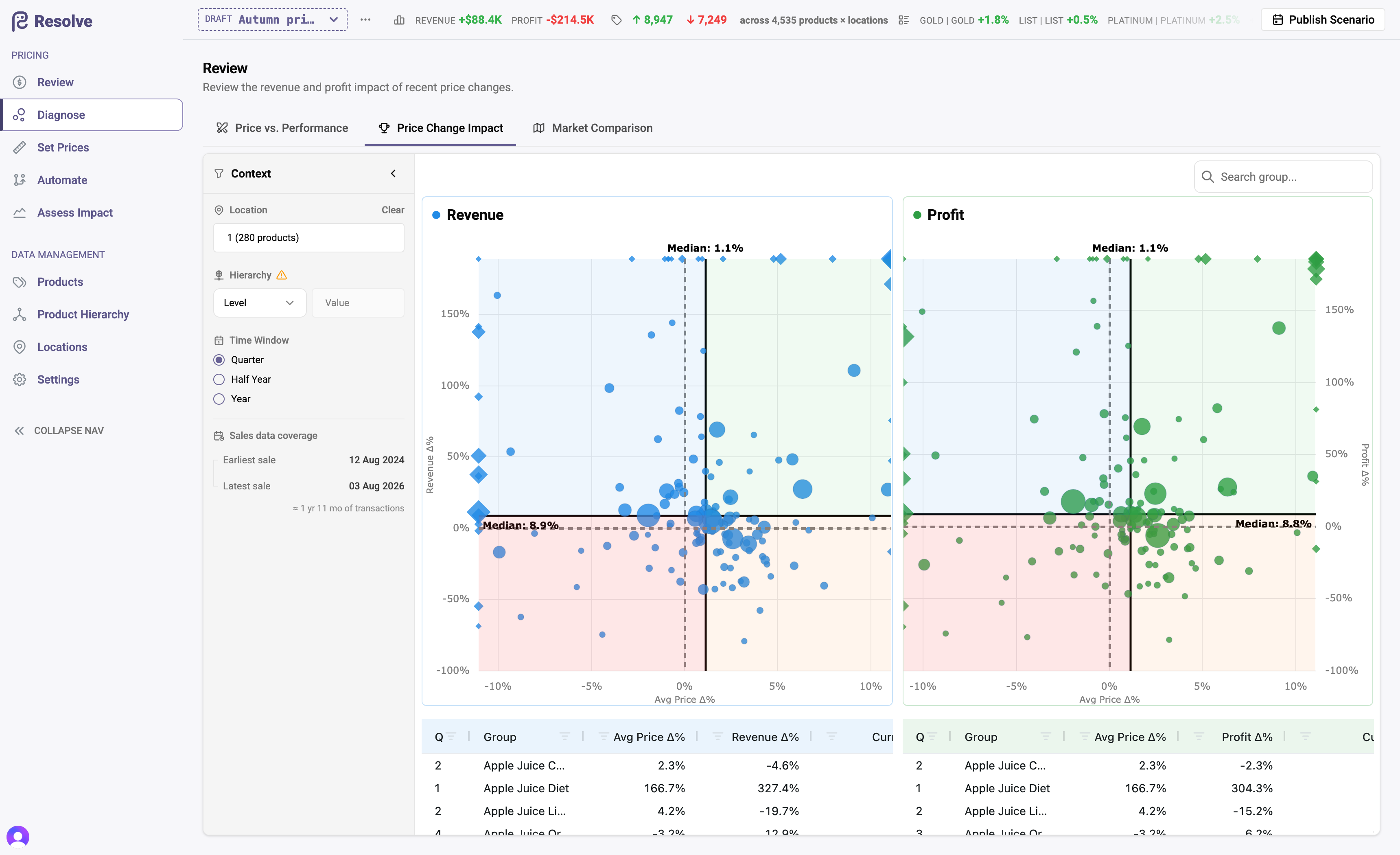
Reading the charts
Two bubble charts plot every product group's average price change for the selected window against its revenue change and profit change. Bubble size is revenue, so the groups that matter dominate the picture.
What the positions mean:
- Price up, profit up — the increase held; volumes absorbed it.
- Price up, revenue down — volume gave back more than the price gained; check whether profit still improved (margin can win while revenue slips).
- Price down, revenue up — the cut bought volume; the profit chart tells you whether it bought profitable volume.
- Price flat, performance moved — the change came from somewhere other than your pricing: demand, seasonality, competition. Investigate before crediting or blaming price.
Companion tables list each group's numbers exactly, for export into a trading review.
Using it well
- Match the window to the change. Compare the period after a repricing against the equivalent period before it — the sidebar's window controls exist for exactly this.
- Judge on profit, not revenue alone. Margin-led strategies routinely show softer revenue and better profit; this pair of charts is designed to keep both in view.
- Follow up at the group you priced at. If a workflow priced a category, read the category's bubble, not one product's — that's the level the decision was made at.
Use Price vs. Performance to identify the next groups that merit a pricing change.