Price vs. performance
Diagnose is Resolve's analytics home — three views over your sales history that surface where pricing attention will pay. The first tab, Price vs. Performance, maps every product group by its margin and its volume trend, and tells you which quadrant it lands in.
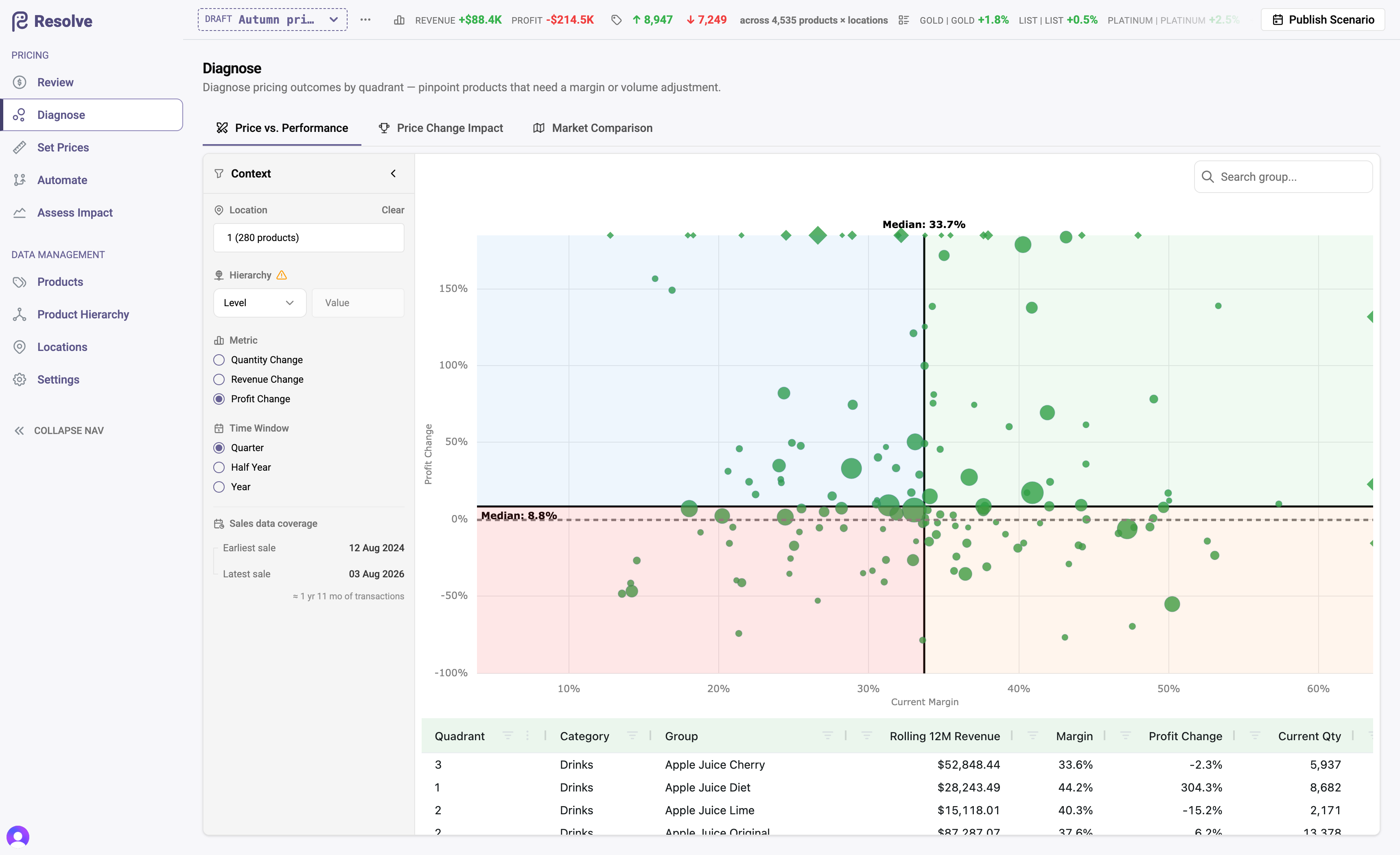
The quadrant view
Each bubble is a product group (a hierarchy level or any attribute you group by — brand, vendor, class), sized by revenue, positioned by current margin against quantity trend. The four quadrants come with a reading:
| Margin | Volume | Reading |
|---|---|---|
| High | Growing | No action required — priced well and winning. |
| Low | Growing | Potential to improve profit by increasing margins — demand is strong enough to carry more price. |
| High | Declining | Potential to improve profit by decreasing margins — price may be choking volume. |
| Low | Declining | Decrease margins if the market is large; increase otherwise — decide whether to fight for the volume or harvest the margin. |
The table below the chart lists every group with its quadrant, rolling twelve-month revenue, margin, and current versus previous quantities — sort it to build a worklist. Rows excluded from the analysis (insufficient data) are listed separately so nothing disappears silently.
Controls
The sidebar drives all three Diagnose tabs: the comparison window (quarter, half-year, or year, and which), the grouping level, a hierarchy or location filter, and the trend metric. A caption always states the extent of the sales data behind the view.
From diagnosis to action
The quadrant reading is a hypothesis, not an order. The productive loop:
- Pick a quadrant outlier with meaningful revenue.
- Check its competitive position (competitor price attributes in the Review grid).
- Express the response as a rule or workflow in a scenario — by hand for a handful of products, automated for a pattern.
- Assess the impact, then publish.
- Come back to Price change impact a period later to see whether the move worked.